
The Colour Palette of 2026: Shades That Will Shape the Future of Interiors
- Aakriti
- Nov 17, 2025
- 3 min read
The design world is stepping into 2026 with a palette that feels warm, rooted, and emotionally intelligent. This year, colours aren’t just decorative, they’re intentional. They’re chosen to support well-being, add depth, and enrich the everyday energy of a home. The 2026 colour trends reflect a collective desire for grounding, comfort, connection to nature, and mindful living. Think earthy pigments, botanical greens, soft clays, and expressive accents that add quiet confidence to a space.
Whether you're refreshing a single room or reimagining your entire home, here’s the ultimate guide to the Top Colour Palettes of 2026, how to use them, and why they’re shaping the future of interior design.

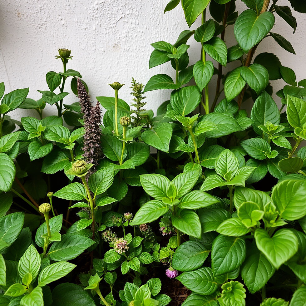
Warm Eucalyptus: The Colour of the Year 2026
Soft, soothing, and deeply grounding, Warm Eucalyptus is the hero shade of 2026. It blends muted green with a warm undertone, making it both refreshing and comforting.
Why it’s trending:
Enhances calmness and mental clarity
Works beautifully with natural materials (wood, stone, jute)
Perfect for biophilic and Vastu-aligned interiors
Where to use it: Bedrooms, living rooms, meditation corners, entryways. Pairs well with: Warm beige, soft browns, off-white, dusty sage
Earth-Rooted Browns & Clay Neutrals
Cool greys and stark whites step aside - earthy browns, clays, mocha, caramel, and terracotta are becoming foundational in 2026.
Why it’s trending:
Adds warmth and emotional richness
Creates grounded, cocooning spaces
Complements both minimal and maximal design styles
Where to use it: Living rooms, dining spaces, accent walls. Paired well with: Natural wood, brass, woven textures, eucalyptus green

Quiet Luxury Neutrals
Soft taupe, mushroom beige, warm ivory, and greige with warmer undertones, the 2026 neutral palette has evolved into something soft, luxurious, and extremely livable.
Why it’s trending:
Creates a calm, high-end backdrop
Perfect for minimalist or Japandi interiors
Ideal base for layering textures (linen, stone, wool, cane)
Where to use it: Large living spaces, open layouts, furniture upholstery
Sunset-Inspired Accents
Accent colours in 2026 are mood-based and expressive.Expect soft coral, muted rust, golden ochre, toasted apricot, and warm blush, hues that feel like the sky at golden hour.
Why it’s trending:
Adds vibrancy without overwhelming the space
Perfect for expressive maximalism
Brings warmth into cooler architectural spaces
Where to use it: Art, cushions, side tables, lamps, vases, feature chairs
Botanical Greens & Deep Olive
Green remains a major design force, but shifts toward botanical, nurturing shades.Expect deep olive, garden green, mossy tones, and soft herbal greens.
Why it’s trending:
Aligns with biophilic and Vastu principles
Symbolises growth, peace, and stability
Works beautifully with wood and natural textiles
Charcoal Soft Black: The New Bold Neutral
Not harsh black, but a softened charcoal with depth and elegance.Perfect for adding contrast while keeping interiors calm and sophisticated.
Why it’s trending:
Adds drama without heaviness
Complements warm woods and earthy palettes
Works beautifully in modern luxury homes
Where to use it: Window frames, hardware, accent walls, cabinetry
How to Build Your Own 2026 Colour Palette
Use this formula to create a cohesive interior that aligns with 2026 design trends:
60% – Warm Naturals (taupe, clay, beige, warm white)
30% – Earthy Base Colours (brown, eucalyptus, olive)
10% – Sunset Accents (apricot, coral, ochre)
This approach ensures your home feels modern, grounded, and timeless, not trend-dependent.
A Year of Warmth, Grounding & Emotional Design
The 2026 interior colour palette is a beautiful blend of nature, emotion, and expressive individuality.These shades don’t just decorate a space, they shape how we feel within it. Whether you lean toward earthy warmth, soft neutrals, or expressive accents, 2026 is the year to design with intention and create spaces that nourish, comfort, and inspire.


Comments